

Business Cards!
Page 2 of 6 •  1, 2, 3, 4, 5, 6
 ![]()

Metina- Admin
- Number of posts : 3708
Age : 49
Location : Washington DC, Metro
Registration date : 2008-09-04 -

Re: Business Cards!
![]() by Metina Tue Sep 01, 2009 2:23 pm
by Metina Tue Sep 01, 2009 2:23 pm
I think what you have is quite nice and I may have to steal, I mean borrow, a version of it for my next printing!
Metina- Admin
- Number of posts : 3708
Age : 49
Location : Washington DC, Metro
Registration date : 2008-09-04 -
Re: Business Cards!
![]() by Guest Tue Sep 01, 2009 2:30 pm
by Guest Tue Sep 01, 2009 2:30 pm
I don't have any children on my business card either... all adults. It's easier not to use minors on permanent marketing materials.
Guest- Guest
Re: Business Cards!
![]() by photomomma6 Tue Sep 01, 2009 11:12 pm
by photomomma6 Tue Sep 01, 2009 11:12 pm
Perry Noia wrote:haha..
I'm so sorry to hear that
I hope to meet you next summer! I plan to go back again, I'm carpooling this time instead of flying, it'll be cheaper and it's only a 12 hr drive. Make sure you apply for the scholarship, they made a lot on the auction this year so they should be giving out quite a few of them.
That sounds great!! I was actually in Indiana all summer from June to August, so it wouldn't have worked out anyway. But, yes, scholarships are what I'm all about there...when I told my husband the price, he almost choked on his salami, but a scholarship might do nice---MEN--they don't know what it's all about--at least the NON clowning men that is. Thanks!

photomomma6- Number of posts : 466
Age : 56
Location : Anderson, IN
Registration date : 2009-08-31 -
Re: Business Cards!
![]() by WyndyO Tue Sep 01, 2009 11:38 pm
by WyndyO Tue Sep 01, 2009 11:38 pm
I guess I like the first one from a business standpoint of showing all the different types of "art" you provide. I would use your scary face (it is you and that makes it more cool) as the first tile. Your glamour face/gold leaf face as the 2nd. Your henna as the 3rd. The art glass/dove body paint as the 4th tile. Your wolf hand as the final tile (finishing with the wolf emphasizes your name!).
- traditional facepainting
- glamour makeup
- body makeup and art paint/gestational
- henna (maybe add one of those in)
- hand painted tattoos

WyndyO- Number of posts : 779
Location : Tampa Bay Florida
Registration date : 2008-11-11 -
Re: Business Cards!
![]() by Guest Wed Sep 02, 2009 12:07 am
by Guest Wed Sep 02, 2009 12:07 am
Guest- Guest
Re: Business Cards!
![]() by reneec808 Wed Sep 02, 2009 12:17 am
by reneec808 Wed Sep 02, 2009 12:17 am

reneec808- Number of posts : 188
Location : Honokaa, Hawaii
Registration date : 2009-05-11
Re: Business Cards!
![]() by LoneWolf Wed Sep 02, 2009 4:44 am
by LoneWolf Wed Sep 02, 2009 4:44 am
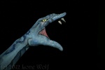
WyndyO wrote:Lone- All of your designs are awesome!!! You are a Seeboden World Body Painting award winner! Would it be considered bad form mentioning that on your card somewhere by European standards? Maybe suggest all the types of events you do or a tagline if you have one.
I guess I like the first one from a business standpoint of showing all the different types of "art" you provide. I would use your scary face (it is you and that makes it more cool) as the first tile. Your glamour face/gold leaf face as the 2nd. Your henna as the 3rd. The art glass/dove body paint as the 4th tile. Your wolf hand as the final tile (finishing with the wolf emphasizes your name!).
- traditional facepainting
- glamour makeup
- body makeup and art paint/gestational
- henna (maybe add one of those in)
- hand painted tattoos
I did not win in Seeboden? But I have won the Danish bodypainting championship. It is written on my homepage (when it will work again!). Thought about write what I do and to what type of events, but people rarely read anything, and I would have to write it really small - and therefore hard to read for some - to have it all. So I chose to have pictures instead.
On each card I have tried to have a broad selection of each with facepainting, temporary tattoos / bodypaint and makeup. I chose not to have special effects on, since I rarely work with that. And I have just stated doing henna, so don't have so many pictures (plus don't think the marked is so big).
Ended up ordering a banner with each design, since they didn't cost that most =)
Thank you for all your feedback!
LoneWolf- Number of posts : 1340
Age : 42
Location : Denmark
Registration date : 2008-10-04 -
Re: Business Cards!
![]() by Rosenberg-Cox Mon Sep 28, 2009 6:25 pm
by Rosenberg-Cox Mon Sep 28, 2009 6:25 pm
 [/img]
Rosenberg-Cox- Number of posts : 236
Location : Middle Midwest (Kansas/Missouri USA)
Registration date : 2009-08-27 -
Re: Business Cards!
![]() by Painted Dragon Mon Sep 28, 2009 7:54 pm
by Painted Dragon Mon Sep 28, 2009 7:54 pm

Painted Dragon- Number of posts : 529
Age : 52
Location : Eastern Iowa
Registration date : 2009-04-09 -
Painted Dragon- Number of posts : 529
Age : 52
Location : Eastern Iowa
Registration date : 2009-04-09 -
Re: Business Cards!
![]() by Metina Mon Sep 28, 2009 8:33 pm
by Metina Mon Sep 28, 2009 8:33 pm
Metina- Admin
- Number of posts : 3708
Age : 49
Location : Washington DC, Metro
Registration date : 2008-09-04 -
Re: Business Cards!
![]() by Perry Noia Mon Sep 28, 2009 8:48 pm
by Perry Noia Mon Sep 28, 2009 8:48 pm

Perry Noia- Number of posts : 3523
Age : 44
Location : In my own little world... in Windsor, Ontario
Registration date : 2008-12-12 -
Re: Business Cards!
![]() by JBax Mon Sep 28, 2009 10:58 pm
by JBax Mon Sep 28, 2009 10:58 pm


JBax- Number of posts : 1890
Age : 48
Location : Indianapolis, IN
Registration date : 2009-08-30 -
Re: Business Cards!
![]() by Guest Tue Sep 29, 2009 1:35 am
by Guest Tue Sep 29, 2009 1:35 am
Try to choose your BEST 1 to 5 faces only and make THEM the focal point.
And try to separate your website text from the black line drawings... for eyes that blur (like mine) it all runs together.
You can use all those photos on a postcard - make them larger though.
Guest- Guest
Re: Business Cards!
![]() by Perry Noia Tue Sep 29, 2009 8:01 am
by Perry Noia Tue Sep 29, 2009 8:01 am

Perry Noia- Number of posts : 3523
Age : 44
Location : In my own little world... in Windsor, Ontario
Registration date : 2008-12-12 -
Re: Business Cards!
![]() by Rosenberg-Cox Tue Sep 29, 2009 9:41 am
by Rosenberg-Cox Tue Sep 29, 2009 9:41 am

Rosenberg-Cox- Number of posts : 236
Location : Middle Midwest (Kansas/Missouri USA)
Registration date : 2009-08-27 -
Re: Business Cards!
![]() by Painted Dragon Tue Sep 29, 2009 9:44 am
by Painted Dragon Tue Sep 29, 2009 9:44 am
I think that if you kept your faces more uniform: all ovals or all squares or something like that, it would look cleaner.
Painted Dragon- Number of posts : 529
Age : 52
Location : Eastern Iowa
Registration date : 2009-04-09 -
Re: Business Cards!
![]() by Perry Noia Tue Sep 29, 2009 10:08 am
by Perry Noia Tue Sep 29, 2009 10:08 am
Perry Noia- Number of posts : 3523
Age : 44
Location : In my own little world... in Windsor, Ontario
Registration date : 2008-12-12 -
Re: Business Cards!
![]() by Rosenberg-Cox Tue Sep 29, 2009 11:29 am
by Rosenberg-Cox Tue Sep 29, 2009 11:29 am
Rosenberg-Cox- Number of posts : 236
Location : Middle Midwest (Kansas/Missouri USA)
Registration date : 2009-08-27 -
Re: Business Cards!
![]() by Guest Tue Sep 29, 2009 12:50 pm
by Guest Tue Sep 29, 2009 12:50 pm
It may have appealed to people - it is pretty, but, to get attention with a business card you need to be more graphic and get the focal point to be what people see... the background is still too bright and overpowers your images.
If you have full face designs in bright bold colours that show up against that background (like bright green/blue/purple) that would balance it more, but your designs are more delicate and still hard to see.
It is a great background but maybe take it down in brightness - make it pastels or fairly transparent for use with your cards and printed material.
Ultimately it is YOUR choice... but you do want the customers to see your work, then your contact information - the background is just window dressing.
Guest- Guest
Re: Business Cards!
![]() by Rosenberg-Cox Tue Sep 29, 2009 1:34 pm
by Rosenberg-Cox Tue Sep 29, 2009 1:34 pm
This is what I did over lunch. Again, please comment. [img]

Rosenberg-Cox- Number of posts : 236
Location : Middle Midwest (Kansas/Missouri USA)
Registration date : 2009-08-27 -
Re: Business Cards!
![]() by Painted Dragon Tue Sep 29, 2009 1:43 pm
by Painted Dragon Tue Sep 29, 2009 1:43 pm
Painted Dragon- Number of posts : 529
Age : 52
Location : Eastern Iowa
Registration date : 2009-04-09 -
Painted Dragon- Number of posts : 529
Age : 52
Location : Eastern Iowa
Registration date : 2009-04-09 -
Perry Noia- Number of posts : 3523
Age : 44
Location : In my own little world... in Windsor, Ontario
Registration date : 2008-12-12 -
Page 2 of 6 • 1, 2, 3, 4, 5, 6 ![]()
» My New Business Cards!
» Con-crit on new business cards?
» use for old business cards
» Business cards!
|
|
|