Looking for constructive criticism
+3
Katurah
PrairiePainter
Sonyalynn
7 posters
Page 1 of 1
 Looking for constructive criticism
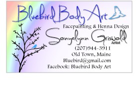
I have designed a business card for myself. I went with NymphWing designs for a business name and designed the logo over the last few days. I need some constructive criticism. I really like it but I know that some of you are graphic designers also and life is so much easier with critiques. So my feelings won't be hurt and I won't throw a temper tantrum. I just need to know honest opinions and suggestions. If you like it, why? what do you like? If you don't like it why? What don't you like about it? Thank you guys for being so supportive so far!


Sonyalynn- Number of posts : 23
Age : 41
Location : Old Town, Maine
Registration date : 2013-05-06
 Re: Looking for constructive criticism
I really think it would benefit from an example of your own work. Other than that it does the trick. Pretty, readable, and it gives a sense of your personal style.

PrairiePainter- Number of posts : 326
Location : Rural Minnesota USA
Registration date : 2013-02-25
 Re: Looking for constructive criticism
PrairiePainter wrote:I really think it would benefit from an example of your own work. Other than that it does the trick. Pretty, readable, and it gives a sense of your personal style.
Although the downside to that could be what I've found to be true. My business cards are outdated, not nessicarily because of the design of the card but the photos I've used. I've since improved my work dramatically and I'm a tad embarrassed about the photos on the card now. So now, looking back, I would choose to not have the photos on my card. But depends on how you feel and how often you will update your cards.
I think your card looks great btw!
 Re: Looking for constructive criticism
Can you really handle it???  I'm always hesitant to be honest so I hope you don't disappear but here goes:
Nymph brings to mind nymphomanic or little green bugs.
When I search on nymph wings it brings up cosplay adult wings and some naughty cartoons. So if you were making wings are part of your craft, that would fit in but it's doesn't bring to mind (or google) face painting.
As far as graphic arts...I think I would have separate cards for face painting that included actual painted images. You might only want to order 250 at a time so that you can update your photos but just one good photo is enough. Take your time and paint a really good blue butterfly on yourself, better than the drawn illustration.
I could see you including henna and face painting in one card but design and crafts really don't go with it. It's cool that you do those things, but I think it takes away from the body art.
So, I think you have to decide where you are going to hand these out and what is their purpose. My cards are intended to get me more children's parties (mostly) because that's who I hand them out to. I hand them out at fairs, at parties I'm already booked at and to the public asking if I do parties. Smiles by Sonjalynn, Blue Butterfly Body Art (if you want to do henna and face painting equally), Wings & Things...make it easy to remember and spell, maybe with some alliteration and no "trickee" spelling.
Lastly, you need to be more bold. It's hard to read. Use a cleaner and bolder font that you can read from arms length. Try to get up to 10 pt if you can.
Sorry to blow it up but better now than a year from now when you are struggling to get people to your website or obnoxious "drunk uncles" ask you for the 50th time if you're a nymph.
 I'm always hesitant to be honest so I hope you don't disappear but here goes:
Nymph brings to mind nymphomanic or little green bugs.
When I search on nymph wings it brings up cosplay adult wings and some naughty cartoons. So if you were making wings are part of your craft, that would fit in but it's doesn't bring to mind (or google) face painting.
As far as graphic arts...I think I would have separate cards for face painting that included actual painted images. You might only want to order 250 at a time so that you can update your photos but just one good photo is enough. Take your time and paint a really good blue butterfly on yourself, better than the drawn illustration.
I could see you including henna and face painting in one card but design and crafts really don't go with it. It's cool that you do those things, but I think it takes away from the body art.
So, I think you have to decide where you are going to hand these out and what is their purpose. My cards are intended to get me more children's parties (mostly) because that's who I hand them out to. I hand them out at fairs, at parties I'm already booked at and to the public asking if I do parties. Smiles by Sonjalynn, Blue Butterfly Body Art (if you want to do henna and face painting equally), Wings & Things...make it easy to remember and spell, maybe with some alliteration and no "trickee" spelling.
Lastly, you need to be more bold. It's hard to read. Use a cleaner and bolder font that you can read from arms length. Try to get up to 10 pt if you can.
Sorry to blow it up but better now than a year from now when you are struggling to get people to your website or obnoxious "drunk uncles" ask you for the 50th time if you're a nymph.
 Re: Looking for constructive criticism
Denise makes a good point about including your jewelry design in your body art card. Some people may assume someone with that many tricks in their bag will only deliver mediocre work because they've got too much on their plate. Maybe you'll nee to create a separate identity for your separate areas of interest.
The nymph IS traditionally considered a sexual character. I didn't make the associatin right away but others may.
The nymph IS traditionally considered a sexual character. I didn't make the associatin right away but others may.

PrairiePainter- Number of posts : 326
Location : Rural Minnesota USA
Registration date : 2013-02-25
 Re: Looking for constructive criticism
I also agree, the name is buggy and doesn't sound like a childrens' entertainer. What about butterfly faces? since you liked bugs?
Or maybe
fairy fly events
Butterfly Entertainment
or something like that?
Also, it doesn't look like an entertainer's card, looks like a bug collector card
Maybe some pictures of kiddos painted?
Or maybe
fairy fly events
Butterfly Entertainment
or something like that?
Also, it doesn't look like an entertainer's card, looks like a bug collector card
Maybe some pictures of kiddos painted?
 Re: Looking for constructive criticism
ON the name.... IF you decide not to go with Nymph Wing... what about LaceWing? Also a type of bug, delicate, pretty, goes with the idea of what you do.
 Re: Looking for constructive criticism
Good suggestion. Lace Wing is a good fairy party sounding name.
 Re: Looking for constructive criticism
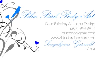
Okay so I took your suggestions and this is what I have. I changed the name and with it the logo and the basic layout of the card. I took off the jewelry and design. I left a drawing for the very reason that Katurah mentioned, I am still learning and rapidly my skill is increasing daily, at least each time I practice so I think having a photo right now would just hold me back. That said I set it up so that once my improvement slows down a bit I can adjust the card to fit in an image by taking things out or just moving them around. I kept the fonts because I love them but adjusted it so that they are both above 10pt. I plan to keep the back pretty much the same. I am not offended by your suggestions, keep them coming.  Thanks for the help! Also please keep in mind that the card is actually 2inX3.5in and not the size you see on your screen.


Sonyalynn- Number of posts : 23
Age : 41
Location : Old Town, Maine
Registration date : 2013-05-06
 Re: Looking for constructive criticism
I love the name. Very memorable and easy to search. I love the little blue bird in the tree, could you enlarge that image until it was coming off of the card so the bird in the tree was bigger and take out the other "loose" bird. I think you should have one or the other and move the Title over to accommodate it. Other than that I would align your information with the "Design" text at the top so they are all on the right margin.
I don't have your fonts but I made a little mockup with the bird bigger etc.

I don't have your fonts but I made a little mockup with the bird bigger etc.

 Re: Looking for constructive criticism
Alright I think it's done!  Clean and still displays my style.


Sonyalynn- Number of posts : 23
Age : 41
Location : Old Town, Maine
Registration date : 2013-05-06
 Re: Looking for constructive criticism
Looks good! Hope you hand out a ton.
Oh, I forgot. I took out your city for a reason. I rarely work in my own town and so you don't want people thinking you're limited to old town.
Oh, I forgot. I took out your city for a reason. I rarely work in my own town and so you don't want people thinking you're limited to old town.
 Re: Looking for constructive criticism
We live in a pretty centralized area, for people around here it's common sense that if you live in Old Town or Orono or any of the surrounding cities that you will travel a bit. Plus when people want to hire me they know where I live and hopefully be more reasonable when it comes to travel.  And beyond a 15 mile radius of Bangor we have miles and miles of miles and miles. On a happy note I will be the only Face painter in that radius!
  It's a little scary too!

Sonyalynn- Number of posts : 23
Age : 41
Location : Old Town, Maine
Registration date : 2013-05-06
 Re: Looking for constructive criticism
PS. You are AMAZING thank you so much for all of your help! Did you draw all of those culyque things on your mockup yourself?

Sonyalynn- Number of posts : 23
Age : 41
Location : Old Town, Maine
Registration date : 2013-05-06
 Re: Looking for constructive criticism
Have you considered adding removal instructions on the backside? Gives you a great reason to hand them out to everyone you've painted!

Kris5115- Number of posts : 754
Location : Twin Cities, MN
Registration date : 2012-04-10
 Similar topics
» Constructive criticism?
» Constructive Criticism
» Opinions and Constructive Criticism
» Constructive Criticism Needed
» My first attempt - constructive criticism please!
» Constructive Criticism
» Opinions and Constructive Criticism
» Constructive Criticism Needed
» My first attempt - constructive criticism please!
Page 1 of 1
Permissions in this forum:
You cannot reply to topics in this forum
