Constructive Criticism Needed
+9
freedspirit
IamGinaW
leapinglizards
PerfectlyPaintedFaces
SuzySparkles
Denise Cold
Perry Noia
Misha
MasterpieceFacePainting
13 posters
Page 1 of 1
 Constructive Criticism Needed
Hi again, I'm in no way an established business or even an established face painter but I'd love to be some day.
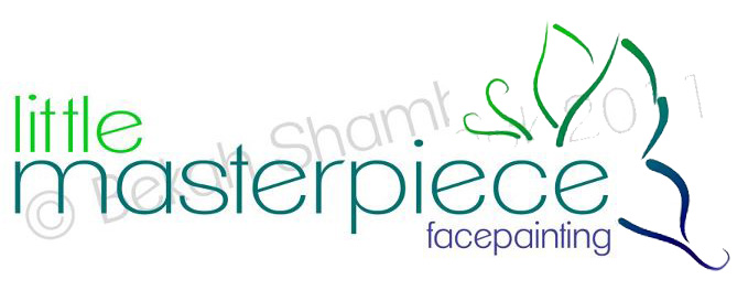
Anyway, back to the point, I came up with a name and a logo for my 'wannabe' business and I'd love to know what you all think. Your feedback means a lot to me...
Ignore the huge watermark across the image, I'm a paranoid person and I'm worried someone will steal it! (not one of you, just someone...)
I'd love to know what you all think, I was trying to avoid in-your-face primary colours while still keeping it somewhat bright and eyecatching...
This would go on a tshirt and business cards, stuff like that.

 Re: Constructive Criticism Needed
I like it. Maybe a suggestion of color on the butterfly, it maybe to abstract for some.

Misha- Number of posts : 329
Age : 50
Location : Western MA
Registration date : 2011-10-24
 Re: Constructive Criticism Needed
It is nice, but I think it would say "butterfly" to me more if you make sure that the top wing is larger than the bottom. You could keep the dark green brush strokes for the wings with maybe a light wash of yellow or pale green in the shape of the full wing behind to give the full wing feel without taking away from your brush stroke idea.
 Re: Constructive Criticism Needed
I think the butterfly needs to be smaller in comparison to the overall design so that the eye can "read" it as a butterfly. I like the fonts and the staggered words.
I'd probably put a butterfly up by the little...maybe landing on the "t" and make it smaller.
Good luck!
D.
I'd probably put a butterfly up by the little...maybe landing on the "t" and make it smaller.
Good luck!
D.
 Re: Constructive Criticism Needed
ehh... kind of boring. the butterfly is a little too abstract, looks messy. Font colors are boring and dont catch attention. No hurt feelings I hope, just being honest.

SuzySparkles- Number of posts : 2778
Age : 46
Location : Wisconsin / Milwaukee
Registration date : 2009-11-09
 Re: Constructive Criticism Needed
I think the faux 'linework' on it could use some work. It doesn't have any flow!
My advice is to print off your logo text, and right on the page, play around with some black face paint line work. When you're happy with how it looks, scan it in. If you have access to a program like Illustrator, you could trace your linework to have a vector version which would allow for beautiful, crisp printing at any size. If you want an idea of tear-drops around your text, just check out my website banner.
Also... using a more unique font is also nice. Check out dafont.com for some free fonts. Try to find one that uniquely represents the message you want to send.
Good luck!
 Re: Constructive Criticism Needed
Idea- Make the "i"s in Little and Masterpiece, sillhouettes if a boy and a girl. redo the butterfly a bit smaller and with more flowing linework as suggested, and angle it so the anteannae are a little more verticle and corl into each other to make a very good heart shape, with VERY light, almost subliminal pink coloring.
Lots of good implied messages in such a piece.
I think Arial Narrow-like font for the word "little" is fine, but "masterpiece" should be in a SLIGHLY fancier font. Off the top of my head.
Lots of good implied messages in such a piece.
I think Arial Narrow-like font for the word "little" is fine, but "masterpiece" should be in a SLIGHLY fancier font. Off the top of my head.
 Re: Constructive Criticism Needed
Thanks so much for the help. I've played with it a bit more, brightened the colours, I'm still avoiding OTT rainbow colours... It's just not me...
I changed the butterfly design to something a little more recognisable, and perhaps more flowing in the linework?
Made the butterfly smaller and changed the font. Amongst other things. So here's my revised logo. What do you think?

I changed the butterfly design to something a little more recognisable, and perhaps more flowing in the linework?
Made the butterfly smaller and changed the font. Amongst other things. So here's my revised logo. What do you think?

 Re: Constructive Criticism Needed
Much better. I like the butterfly so much more and I like how the colors in the fonts are represented in the butterfly.
D.
D.
 Re: Constructive Criticism Needed
Please forgive me for messing with your image but I don't know how to describe it in words. This is just how I would do it (my personal style)...


 Re: Constructive Criticism Needed
Thank you Gina!!! It anchors the butterfly to the text. I wanted to do the same thing but try it on the little. It makes it more "logo" and less label.
D.
Not that its my logo but I appreciate good graphics.
D.
Not that its my logo but I appreciate good graphics.
 Re: Constructive Criticism Needed
I appreciate your feedback so much!
So this is my final logo:

And the logo image for other purposes... Like the back of my tshirt and profile pictures and all that good stuff...

So this is my final logo:

And the logo image for other purposes... Like the back of my tshirt and profile pictures and all that good stuff...

 Re: Constructive Criticism Needed
Yea for you! Such a hard part of going into business, deciding on a name/design! Yours looks great (now will u do mine?!) 

Misha- Number of posts : 329
Age : 50
Location : Western MA
Registration date : 2011-10-24
 Re: Constructive Criticism Needed
Ugh, I sooo wish I joined this forum before jumping into business. I would've made a nice logo like yours 
You know what my logo is? Nothing. Lol, I was kinda using a design from my Vistaprint products as my logo but I want to change it to something more "high-end" looking...
I love yours, the only thing I can think of it that it's pretty much geared only to girls... I suppose the blue and green could appeal to boys?
 Re: Constructive Criticism Needed
it took me 4 years to get a logo... and I didn't plan on it being a logo, it just started out as an image to use on my new name tag for my costume. Then for consistency's sake, I put it on my banners... my business cards... my website... my car wrap.... and gee, now it's a logo.


 Re: Constructive Criticism Needed
if you right click it, you can pick "view image" to see the whole thing
 Re: Constructive Criticism Needed
Oh wow, I love these designs... How did you make them? I'm not a genius in design software, so haven't really attempted to make anything 
 Re: Constructive Criticism Needed
I know i am quite late to the conversation.
The only thing i would be concerned about with the final logo is that "face painting" is the smallest word. If face painting is your business it should be more pronounced on a marketing standpoint.. but it is really kewl. I like it
The only thing i would be concerned about with the final logo is that "face painting" is the smallest word. If face painting is your business it should be more pronounced on a marketing standpoint.. but it is really kewl. I like it
 Similar topics
» Constructive Criticism
» Business Card * Constructive Criticism
» Constructive criticism?
» My first attempt - constructive criticism please!
» Swirly Eye - constructive criticism please
» Business Card * Constructive Criticism
» Constructive criticism?
» My first attempt - constructive criticism please!
» Swirly Eye - constructive criticism please
Page 1 of 1
Permissions in this forum:
You cannot reply to topics in this forum
