

Constructive Criticism
Page 1 of 3 • 1, 2, 3 ![]()

Constructive Criticism
![]() by Kal Mon Sep 01, 2014 7:14 pm
by Kal Mon Sep 01, 2014 7:14 pm

Kal- Number of posts : 433
Age : 39
Location : WV
Registration date : 2014-06-29
Re: Constructive Criticism
![]() by thouartbeautiful Mon Sep 01, 2014 7:41 pm
by thouartbeautiful Mon Sep 01, 2014 7:41 pm

thouartbeautiful- Number of posts : 731
Age : 39
Location : Oregon
Registration date : 2013-09-21 -

Re: Constructive Criticism
![]() by jlirie Mon Sep 01, 2014 11:45 pm
by jlirie Mon Sep 01, 2014 11:45 pm
practicing with good quality supplies will make you better, faster.

jlirie- Number of posts : 1812
Location : us
Registration date : 2014-07-31
Re: Constructive Criticism
![]() by Forest-Fairy Thu Sep 04, 2014 3:03 pm
by Forest-Fairy Thu Sep 04, 2014 3:03 pm

Forest-Fairy- Number of posts : 1672
Age : 36
Location : BC. Canada
Registration date : 2014-03-13 -
Re: Constructive Criticism
![]() by Kal Thu Sep 04, 2014 6:53 pm
by Kal Thu Sep 04, 2014 6:53 pm
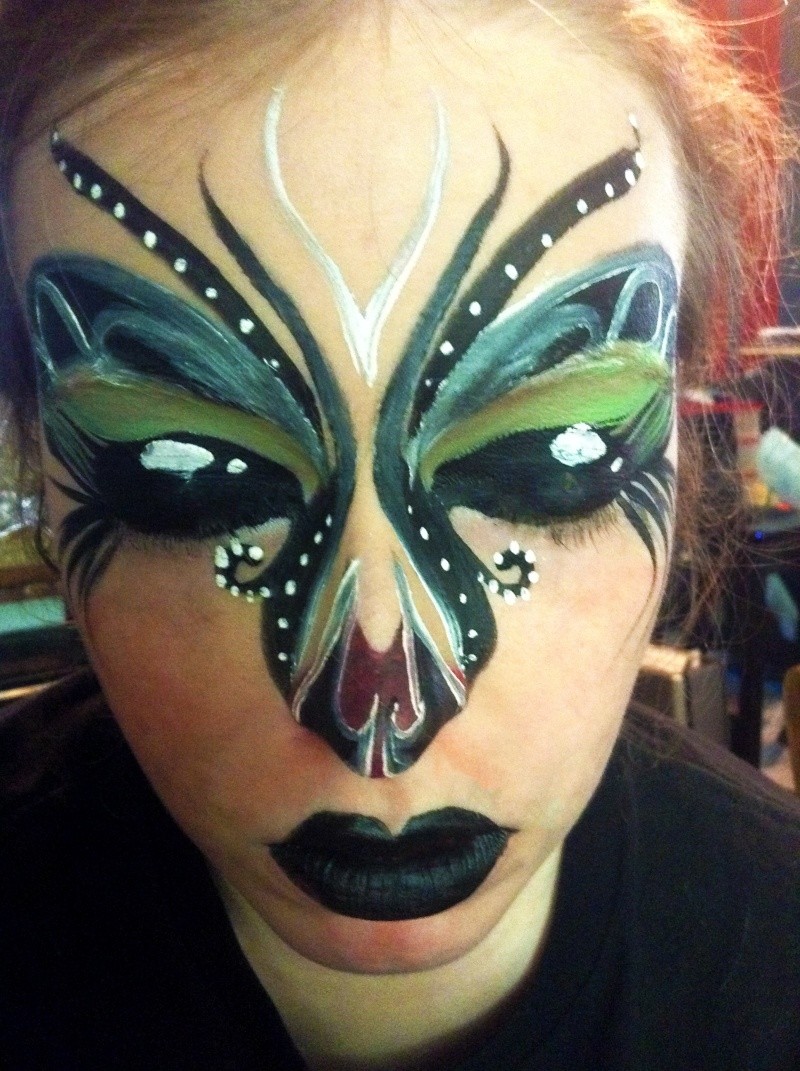
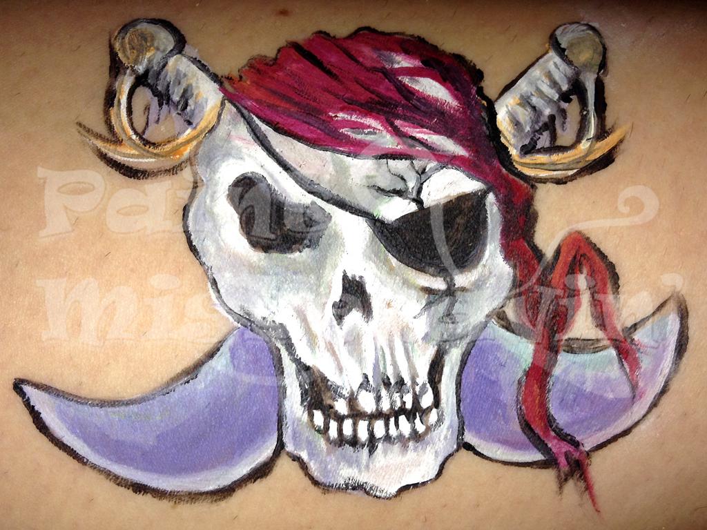
This one was a learning experience.
My dots under her right eye look awful and I will never set up a piece where fine lining ends up in the eyebrows again.
Aside from that any and all criticism is welcome... Fire away!
Kal- Number of posts : 433
Age : 39
Location : WV
Registration date : 2014-06-29
Re: Constructive Criticism
![]() by Forest-Fairy Thu Sep 04, 2014 7:15 pm
by Forest-Fairy Thu Sep 04, 2014 7:15 pm
This design is very interesting to look at as a high fashion or glamour piece, but If i were to do it as a face painting design that needed to be done fast, i would trim down the detail on the nose mostly where line work is involved.
Good job.
Forest-Fairy- Number of posts : 1672
Age : 36
Location : BC. Canada
Registration date : 2014-03-13 -
Re: Constructive Criticism
![]() by Kal Fri Sep 05, 2014 6:20 am
by Kal Fri Sep 05, 2014 6:20 am
Kal- Number of posts : 433
Age : 39
Location : WV
Registration date : 2014-06-29
Re: Constructive Criticism
![]() by Giggle Loopsy Fri Sep 05, 2014 9:09 am
by Giggle Loopsy Fri Sep 05, 2014 9:09 am

Giggle Loopsy- Number of posts : 87
Location : Denver, CO
Registration date : 2014-08-05 -
Re: Constructive Criticism
![]() by jlirie Fri Sep 05, 2014 9:24 am
by jlirie Fri Sep 05, 2014 9:24 am
the usual suspects for clean, opaque line work are wolfe, dfx, and tag. i can vouch for wolfe.
jlirie- Number of posts : 1812
Location : us
Registration date : 2014-07-31
Re: Constructive Criticism
![]() by Kal Fri Sep 05, 2014 12:55 pm
by Kal Fri Sep 05, 2014 12:55 pm
I think the real problem with my Fantasy FX white is that I haven't found a brush that agrees with my iron fist yet. As you can see the white dots are white but I'm still getting so many dig marks on any other motion.
Kal- Number of posts : 433
Age : 39
Location : WV
Registration date : 2014-06-29
Re: Constructive Criticism
![]() by jlirie Fri Sep 05, 2014 9:06 pm
by jlirie Fri Sep 05, 2014 9:06 pm
i have trouble with snazaroo being like clayey pudding, and with white line work going over a base (my other snaz colors), but on bare skin it works better. but i'm about done trying to fight with snaz for details.
just ordered some snaz iridescent powders and mehron gem powders to see how they work, for bases and maybe wet for line work. and maybe adding some wolfe metallics for line work.
jlirie- Number of posts : 1812
Location : us
Registration date : 2014-07-31
Re: Constructive Criticism
![]() by Kal Sat Sep 06, 2014 4:39 pm
by Kal Sat Sep 06, 2014 4:39 pm
Face painting:

Extreme Makeup:

Kal- Number of posts : 433
Age : 39
Location : WV
Registration date : 2014-06-29
Re: Constructive Criticism
![]() by jlirie Sat Sep 06, 2014 10:19 pm
by jlirie Sat Sep 06, 2014 10:19 pm
it would probably help to invest in one of the wax based face paints known for good line work, wolfe, dfx, tag, etc.
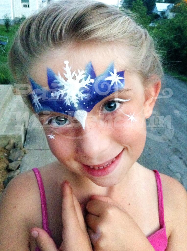
i find blending similar colors with a main color in a design makes it more interesting, like you did with the gold green/orange in your leaves, blue/light blue in the snow crown, red/white in the last picture. btw, snowflakes are 6 pointed, not 8
jlirie- Number of posts : 1812
Location : us
Registration date : 2014-07-31
Re: Constructive Criticism
![]() by LittleMonsters Sat Sep 06, 2014 10:38 pm
by LittleMonsters Sat Sep 06, 2014 10:38 pm
The rest are ok - the first one with leaves, pumpkins and ladybug... I like the overall design, but I find the black outline too heavy and the same for the white highlights. I think if those pumpkins sat higher up on the cheek than the currently do, perhaps overlapping the leaves it might have made it a stronger design.
The ice princess I feel could use some more... you added the large snowflake in the middle and some star bursts and some dots along with some white lines over the eye lids - but maybe some tear drops or some whimsical wispy lines would make it pop a little more.
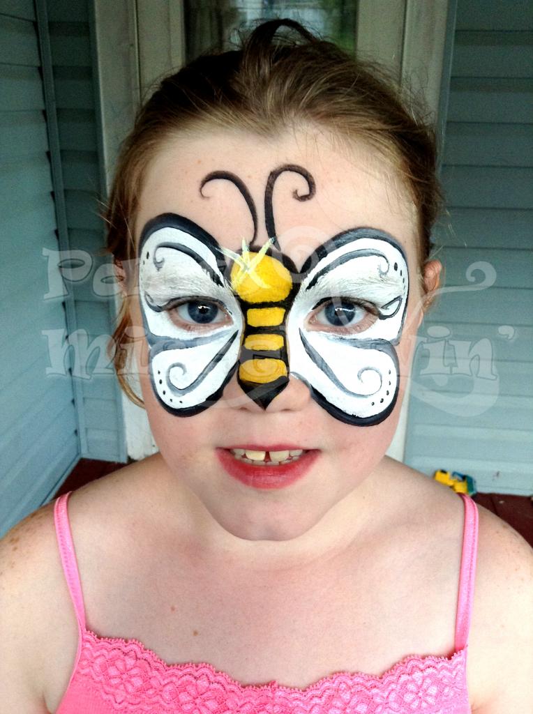
The butterfly, I feel with the body being so large, it could have done with some highlights or something that makes better use of that much space. One thing that I always like about butterflies are the beautiful colors in their wings! I find the white to be a little boring... but of course, if that's what the child asks for then we provide. You did add some dots and some curvy lines but is there anything else in this space you could have done to make it more interesting? Perhaps a different shape to the wings would have helped. Instead of just rounded, perhaps a little more angular with rounded points and sections. You could still add tear drops and more star bursts to this one too.
All that being said, when reading above, the best criticism you could get is to invest in some good face paint... move away from that creamy stuff and get some good solid brand that holds up well and is easy to work. Your line work will definitely improve.
I hope my comments came off as constructive and not harsh... sometimes things aren't conveyed the same way when written over the internet.

LittleMonsters- Number of posts : 397
Age : 39
Location : Canada
Registration date : 2014-08-30 -
Re: Constructive Criticism
![]() by Kal Sun Sep 07, 2014 6:49 am
by Kal Sun Sep 07, 2014 6:49 am
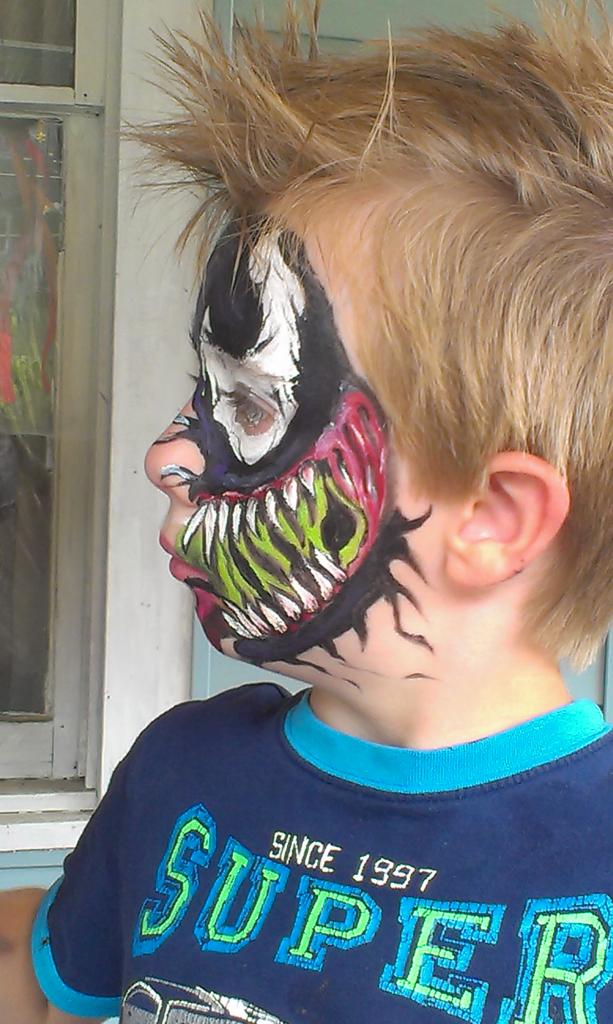
Venom is a Halloween private appointment special only. He takes too long and too much work to do any other time.
The ice princess is done solely with Paradise, no Fantasy FX.
I know line work is my biggest downfall right now so I will pick up a pot of wolfe black this week but I need a good brush too. Can you guys recommend a standard size and brand that will work with my lead grip?
Kal- Number of posts : 433
Age : 39
Location : WV
Registration date : 2014-06-29
Re: Constructive Criticism
![]() by fesspenter Sun Sep 07, 2014 9:59 am
by fesspenter Sun Sep 07, 2014 9:59 am
Happy Painting!

fesspenter- Number of posts : 3352
Age : 63
Location : Toronto, Ontario, Canada
Registration date : 2011-04-29 -
jlirie- Number of posts : 1812
Location : us
Registration date : 2014-07-31
Giggle Loopsy- Number of posts : 87
Location : Denver, CO
Registration date : 2014-08-05 -
Re: Constructive Criticism
![]() by Kal Mon Sep 08, 2014 11:50 am
by Kal Mon Sep 08, 2014 11:50 am
Kal- Number of posts : 433
Age : 39
Location : WV
Registration date : 2014-06-29
Kal- Number of posts : 433
Age : 39
Location : WV
Registration date : 2014-06-29
Re: Constructive Criticism
![]() by jlirie Wed Sep 10, 2014 11:15 pm
by jlirie Wed Sep 10, 2014 11:15 pm
jlirie- Number of posts : 1812
Location : us
Registration date : 2014-07-31
Re: Constructive Criticism
![]() by Kal Thu Sep 11, 2014 6:40 am
by Kal Thu Sep 11, 2014 6:40 am
Kal- Number of posts : 433
Age : 39
Location : WV
Registration date : 2014-06-29
Re: Constructive Criticism
![]() by thouartbeautiful Thu Sep 11, 2014 11:58 am
by thouartbeautiful Thu Sep 11, 2014 11:58 am
thouartbeautiful- Number of posts : 731
Age : 39
Location : Oregon
Registration date : 2013-09-21 -
Re: Constructive Criticism
![]() by Kal Thu Sep 11, 2014 12:19 pm
by Kal Thu Sep 11, 2014 12:19 pm
Kal- Number of posts : 433
Age : 39
Location : WV
Registration date : 2014-06-29
Re: Constructive Criticism
![]() by Lady Jayde Thu Sep 11, 2014 1:25 pm
by Lady Jayde Thu Sep 11, 2014 1:25 pm
However, I can offer suggestions, and I have 2:
1. Designs like butterflies, dragonflies, etc. look best when they enhance the face and flow with the faces shape. If you keep the design focused in the area that would normally be covered by say, swim goggles and avoid the nasal fold, the viewers eyes will be drawn into the eyes of the person wearing the design. (Not literally, that's just creepy!) Also, try for soft gradations of color intensity as opposed to blocks of solid colors ... In my opinion, it softens the delivery of the butterfly. The center of the butterfly, if kept to a small scale, will allow the wing work to stand out as it should. You had a white butterfly or I think it was a bee posted, but the wings and body were competing. If it is to be a bee, I'd give the vibrancy to the yellow body and paint the wings with a semi transparent pearl white with fine outlines and webbing detail. If it's to be a butterfly, I'd downplay the body ( my eyes were first drawn to the yellow body)
2. As for getting your whites to stand out more and your blacks to pop, consider your base. White, I don't care if it's beeswax or glycerine based, is always going to struggle when painted over black. There are techniques to overcome this, but that requires more time than is usually available at a high tempo event. If you paint, light to dark, you will avoid a lot if those issues. I always save my darkest, non base element painting for last. If you can master blocking, you can paint around areas that you know need to be solid white or lay you white first. The key to getting your whites to pop against dark colors is estrangement...seriously, wet paints "mingle" and create new colors. Let your white show up late to the party...all of you color blending will have been done and everything pretty much bone dry. And just like the party wallflower, your white will be able to exist without actually blending into the established crowd.
For dots, which I feel strongly should only be painted as subtle accents, it's the same thing...party wallflower. And make sure your brush is well loaded so only paint touches the design and not the bristles ( if the wallflower touches someone at the party...she has to interact...and blending could occur!)
A heavy hand can only be cured by practicing varying your line strength in a single stroke. While lead feet are cured with traffic tickets, there are no such avenues if rehabilitation for painters. Practice, practice, practice. One painter I know actually forced her own rehab by only painting with #3 brushes. The smaller brush helped her with finer lines and she had to learn pressure variance in order to get thicker ones. I don't know how she made that work ... I mean, wouldn't that just make you heavier handed when you went back to your 4's and 6's? To each his own... I'm a 2,3,4 painter myself and usually reserve larger for body painting.
I hope I provided something of value in my long winded diatribe!

Lady Jayde- Number of posts : 1844
Age : 53
Location : Cleveland, Ohio
Registration date : 2009-08-10 -
Page 1 of 3 • 1, 2, 3 ![]()
» Constructive criticism?
» My first attempt - constructive criticism please!
» Swirly Eye - constructive criticism please
» Opinions and Constructive Criticism