

New Banner
+3
AngieAnders
Just Jenny
KathyO
7 posters
Page 1 of 1

New Banner
![]() by KathyO Wed Jun 17, 2009 9:46 pm
by KathyO Wed Jun 17, 2009 9:46 pm
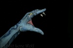
My daughter Gina is studing to become a graphic's designer so I put her to work to design a banner for me to use on my tent for festivals. I think she did a great job.
I have attached the photo but I can't see it when I do a preview so I will also place it in my gallery
I have attached the photo but I can't see it when I do a preview so I will also place it in my gallery

KathyO- Number of posts : 240
Age : 65
Location : Louisville KY
Registration date : 2008-10-29
Re: New Banner
![]() by Just Jenny Wed Jun 17, 2009 10:23 pm
by Just Jenny Wed Jun 17, 2009 10:23 pm
That is awesome!!!! Does she want to make one for me? I need one too!
Great Job, wonderful banner.
Jenny
Great Job, wonderful banner.
Jenny
Just Jenny- Number of posts : 465
Age : 87
Location : Aspen Hill Maryland
Registration date : 2008-10-16 -


AngieAnders- Number of posts : 1849
Age : 46
Location : East Texas
Registration date : 2008-09-22 -

Criss- Number of posts : 906
Location : Lethbridge, Alberta
Registration date : 2009-06-07

contrachapado- Number of posts : 751
Age : 41
Registration date : 2009-01-05
Re: New Banner
![]() by KathyO Thu Jun 18, 2009 9:51 am
by KathyO Thu Jun 18, 2009 9:51 am
Gina will do graphic work for anyone - she will need to charge as she needs to make some money but she won't charge a lot cause she is new and is building up her portifolio - if you want her to do some graphic design just send me an email and I will forward your email to her.
KathyO- Number of posts : 240
Age : 65
Location : Louisville KY
Registration date : 2008-10-29
Re: New Banner
![]() by Metina Thu Jun 18, 2009 6:41 pm
by Metina Thu Jun 18, 2009 6:41 pm
The banner does look very nice, but remember that if you are trying to attract people to your for face painting, FACE PAINTING needs to be the largest.
We all love our business names, but people have to be able to read from a distance what your offering to get them to come over.
But, if you are just using it as say a sponsorship banner, then it looks nice.
A couple of suggestions: I would use a a picture with a lighter color face paint. The blue almost gets lost against the black. A bright pink or similar will contrast a bit better. Also, I would use all white text for the same reason. Also, text in all caps is extremely hard to read. It might be easier to read your website address and commit to memory if it were like this. www.PremierFacePainting.com
Thanks for sharing.
Metina

Metina- Admin
- Number of posts : 3708
Age : 49
Location : Washington DC, Metro
Registration date : 2008-09-04 -
Re: New Banner
![]() by LoneWolf Fri Jun 19, 2009 5:25 am
by LoneWolf Fri Jun 19, 2009 5:25 am
I really like the design, but find it really hard to read the homepage address. The letters are standing to close.
LoneWolf- Number of posts : 1340
Age : 42
Location : Denmark
Registration date : 2008-10-04 -
Re: New Banner
![]() by KathyO Fri Jun 19, 2009 10:06 am
by KathyO Fri Jun 19, 2009 10:06 am
The banner is 2 X 8 feet and I got it last night - looks great. I want to order 3 more so that I can have banners wrap all around the tent. I am going to have Gina change out the pictures so that I will have a different picture for each banner.
KathyO- Number of posts : 240
Age : 65
Location : Louisville KY
Registration date : 2008-10-29
Re: New Banner
![]() by Just Jenny Fri Jun 19, 2009 11:30 pm
by Just Jenny Fri Jun 19, 2009 11:30 pm
KathyO wrote:The banner is 2 X 8 feet and I got it last night - looks great. I want to order 3 more so that I can have banners wrap all around the tent. I am going to have Gina change out the pictures so that I will have a different picture for each banner.
I love that blue butterfly....I couldn't stop looking at it. I wish I could paint like that. I can't imagine having more pictures that are that captivating...I take that back, your gallery is incredible. That is an awesome banner.
Jenny
Just Jenny- Number of posts : 465
Age : 87
Location : Aspen Hill Maryland
Registration date : 2008-10-16 -
» Banner - Which one???
» My First Banner
» BANNER experience HELP!
» $20 2'x10' Banner
» My first banner!
» My First Banner
» BANNER experience HELP!
» $20 2'x10' Banner
» My first banner!
Page 1 of 1
Permissions in this forum:
You cannot reply to topics in this forum|
|
|